On This Page

Understanding Crypto Chart Patterns
Cryptocurrencies have become one of the most demanded digital assets over the past years. However, in spite of their growing popularity, cryptocurrencies remain rather volatile, making them a perfect asset for trading. To understand how trading works, you need to explore chart patterns and trends.
In this article, we will guide you through the most widespread and used crypto chart patterns that will help you orient yourself in trading.

What are crypto chart patterns?
To give a simple definition, crypto chart patterns are formations and trends, used in technical analysis to measure possible crypto price movements, which helps traders to make informed decisions about their next move or identify the best time to buy or sell opportunities in the market.
There are multiple types of crypto chart patterns, and each of them has unique characteristics, shapes, sizes and formations. Ultimately, they all give better chances of profitable trading experience on a crypto exchange platform.
How to read crypto chart patterns?
To read crypto chart patterns, you need to learn that each cryptocurrency price chart consists of a price ticker. Each ticker symbolises the two symbols of the trading pair, like BTC/USDT for example. In this pair, the BTC price is quoted in USDT.
The horizontal price line shows the latest price the asset was traded with, in this case Bitcoin. You can follow the price changes of a certain pair by choosing line charts. The most common and professional ones are Japanese candlesticks, which are drawn to analyze the price action which tells a lot about the trading of a certain time period.
Crypto trading contains risks as well, so it’s better to do a thorough research and understand how crypto exchanges work and how to avoid crypto scams. This knowledge helps to orient better in the exciting world of trading patterns and gives a good base for trading experience.
What are the most common crypto chart patterns?
To have a better understanding of conscious trading, you need to identify many chart patterns. They are not always visible, and some of them may turn out to be invalid after another pattern appears.
As many patterns can be tricky, you need to be flexible and check the latest information available on the pattern.
Reversal Patterns
Reversal patterns help to predict the upcoming movement of the market. They can indicate the change of a pattern from high to low, or the other way around, helping to open or close trades.
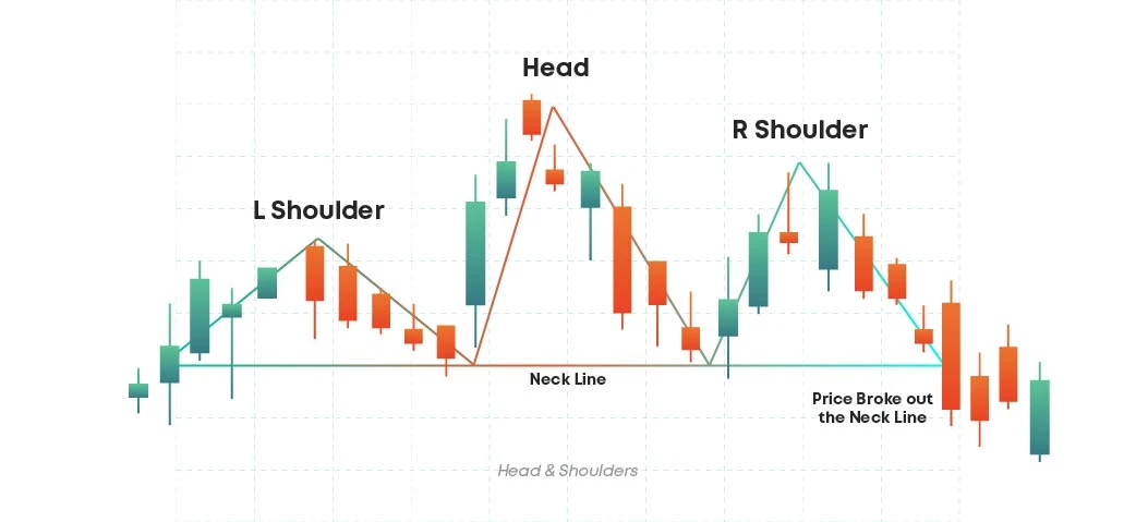
Head and shoulders
The head and shoulder pattern or the regular head and shoulders pattern has 3 swing highs. The middle swing high is the highest of all three and the line connecting the two swing low of the pattern is the neckline. Head and shoulders is one of the most powerful patterns in trading.
In the bearish instance the left shoulder and the head form higher highs highlighting the existing upwards trend. The right shoulder by ending below the head or forming a lower high halts the bullish trend. The break below the neckline confirms a change of trend to bearish. Hence the head and shoulders pattern is a reversal chart pattern.
The volume should increase during the breakdown. Stop loss can be placed above the high of the breakdown candle or above the right shoulder. For the target, measure the distance between the neckline and the head. Then project this distance from the breakdown point.
Inverse head and shoulders
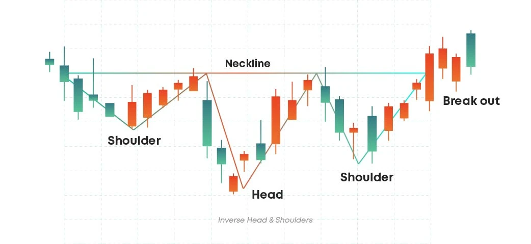
The inverse head and shoulders pattern, also known as inverted head and shoulders pattern, has three swing lows. The middle swing low is the lowest of all three. The line connecting the two swing highs of the pattern is called the neckline.
In the bullish instance, the left shoulder and the head forms the lower lows highlighting the existing downwards trend. The right shoulder, by ending above the head or forming a higher low, halts the bearish trend. The break above the neckline confirms a change of trend to bullish. Hence, the inverse head and shoulders pattern is a reversal chart pattern.
Look to buy on breakout above the neckline or on pullback of the neckline after the breakout. The volume should increase during the breakout. Stop loss can be placed below the low of the breakout candle or below the right shoulder.
For the target, measure the distance between the neckline and the head, then project this distance from the breakout point.
Double top
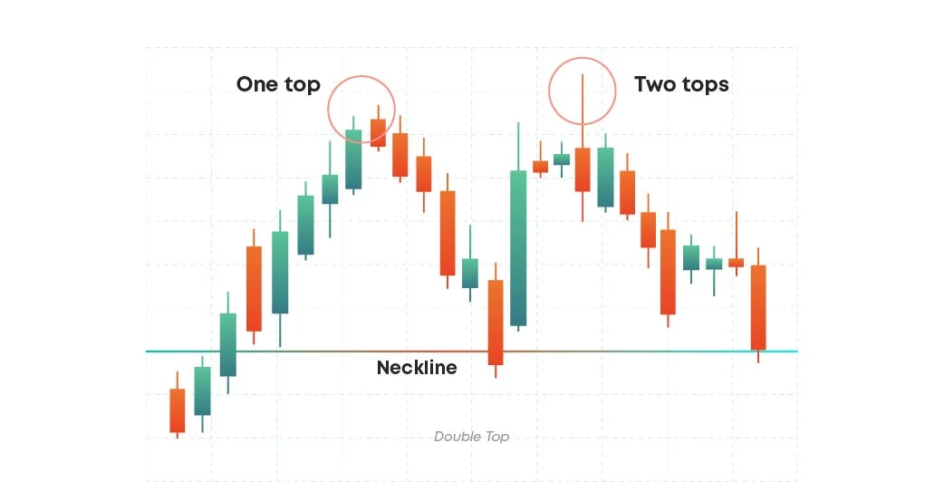
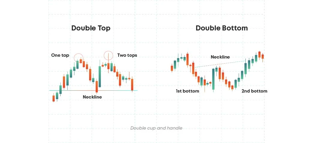
A double top pattern, one of the most used patterns in crypto trading, has two swing highs at around the same price level and the swing in between them projects a support line.
In the double top pattern the first swing high marks the extreme high of an existing upwards trend. When the second swing high fails to push above it, it is a warning that a reversal might occur. Once the market breaks below the support level, it confirms the bearish reversal.
It’s better to sell on breakdown below the support line or on pullback to the previous support line which acts as resistance after the breakdown. As price breaks down the support line, the volume should start to increase. The stop loss can be placed above the breakdown candle highs.
To get the target objective, you need to measure the height of the pattern from the support to the swing high and then project it to the breakdown point.
Double bottom
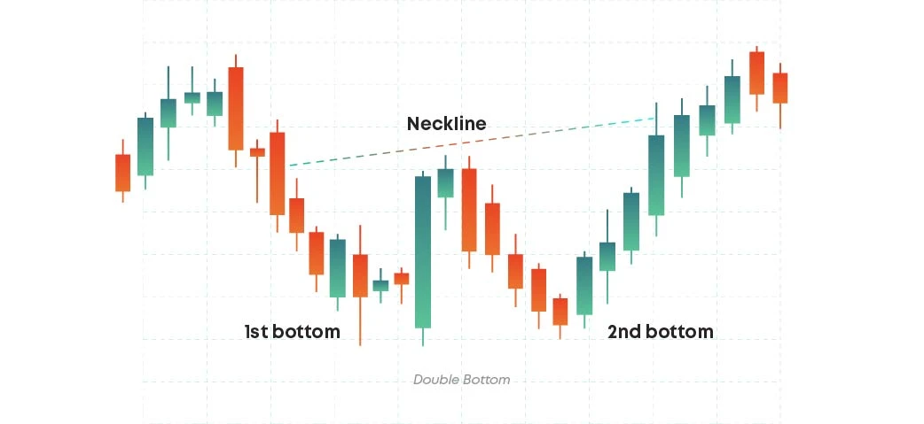
The double bottom pattern is the mirror image of the double top pattern. It has two swing lows at around the same price level. The swing high in between them forms a resistance line or the neckline. In a double bottom pattern, the first swing low marks the extreme low of the existing downwards trend.
When the second swing low fails to push below the previous low, it indicates that the bears are not interested in taking the prices lower. It is a warning that a reversal might occur.
Once the market breaks above the resistance level it confirms the bullish reversal. Look to buy on the breakout above the resistance line or on pullback to the previous resistance line which now acts as a support after the breakout.
The volume should increase as price breaks out of the resistance line. The stop loss can be placed below the low of the breakout candle.
To get the target objective, measure the height of the pattern from the swing low to the resistance and then project it to the breakout point.
Triple top
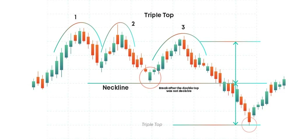
Triple patterns, both top and bottom, share many similarities with double top and double bottom crypto chart patterns. A triple top pattern has three swing highs at around the same price level. The swing lows between them project a support line. The triple top represents the two failed attempts to push above the resistance level to continue with the existing uptrend as established by the first two swing highs.
For a triple top pattern volume should decrease with each upswing. Naturally, it hints at a trend reversal.
A breakdown below the support line confirms a bearish reversal. Look to sell on breakdown below the support level or on pullback to the support line after the breakdown. The volume should increase when price breaks out of the support line.
The stop loss can be placed above the breakdown candle or above the swing high depending on your risk appetite.
For the target objective, measure the height of the pattern from the support level to the swing high and then project it from the breakout point.
Triple bottom
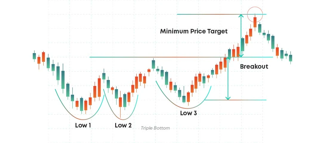
A triple bottom pattern, the mirror version of triple top pattern, is a bullish chart pattern characterised by three equal lows. There should be an existing downtrend in place before the pattern occurs. The three lows should be roughly equal in price and spaced out from each other. The volume should drop throughout the pattern, indicating that the bears are losing strength while the bullish volume should increase as the price breaks out of the resistance.
When dealing with a triple bottom pattern, you should enter long at the breakout or at the first pullback after the breakout and place stop the loss below the resistance or previous support level.
The target will be the distance from the pattern lows to the resistance projected above the resistance.
Wedge
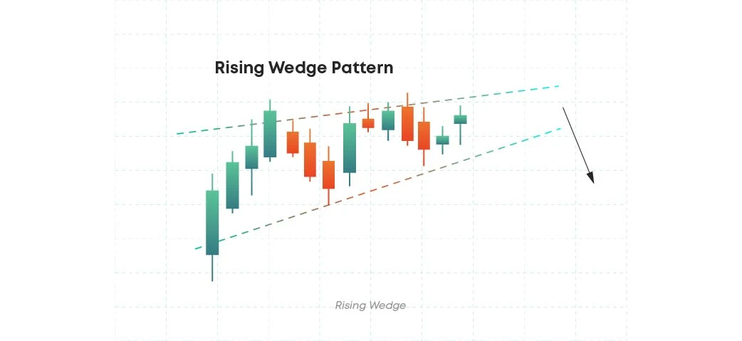
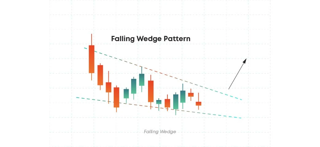
A pattern that forms at the tops or the bottoms of the trend are considered wedge patterns. This pattern is identified with converging straight lines and has two variations, the rising and the falling wedge patterns.
Rising Wedge
The rising wedge pattern is a favourite for many traders as it offers a considerably high level of accuracy if it’s traded correctly. In this pattern, there are two converging lines that are leaning upward. This pattern usually results during a breakdown. When an asset price forms lower highs or visa versa, you know you are dealing with the rising wedge pattern.
Falling Wedge
It’s easy to guess that the falling wedge pattern is the complete opposite of the rising wedge pattern. Falling wedge patterns are bullish reversal chart patterns. They occur when there are higher highs and lower lows. It is possible to identify this kind of patterns when you can identify horizontal support and when the pattern occurs in the middle of an uptrend.
Diamond
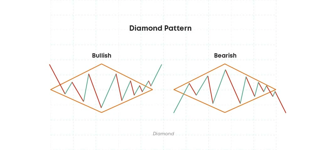
As you can notice, diamond patterns take their name from the shape that they create as the market volatility expands and then contracts before the actual reversal. Diamond pattern signals the end of a bullish or a bearish trend. Mostly found at the top of uptrends, this pattern can also form near the bottom of bearish trends.
Diamond crypto chart patterns are among the most harmonic and complicated, yet very accurate chart patterns in trading.
Symmetrical diamond
In case of a symmetrical diamond pattern, the two converging trend lines have to be roughly symmetrical, connecting the swing highs and lows of the price chart.
Symmetrical diamond patterns can be both bullish and bearish. In the first case, the price moves upwards and the upper trendline slopes higher. In the bearish market, it’s the opposite, as the price moves downwards, and the downward trend line slopes lower.
Ascending diamond
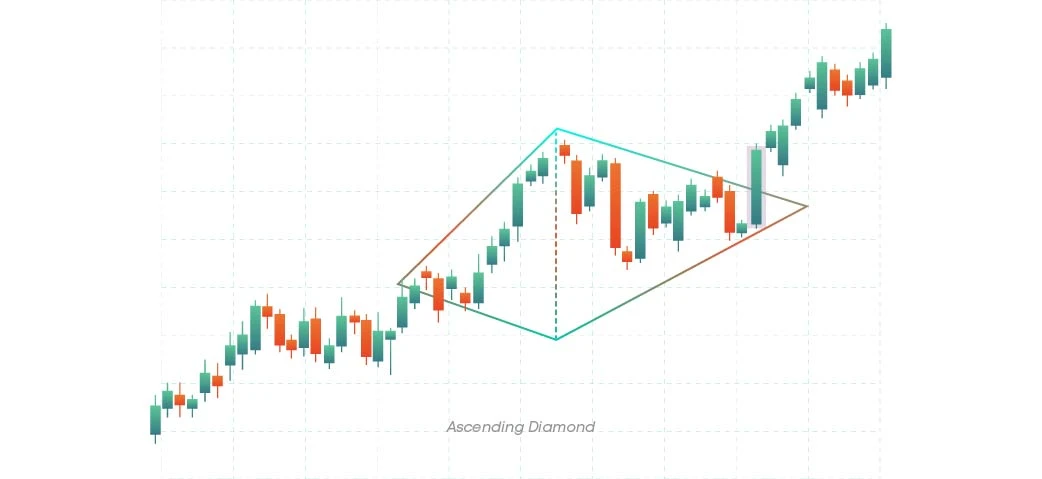
In the ascending diamond chart pattern, the upper trendline is sloping upward. The trading volume increases after the breakout above the upper trend line and here you can enter a long trade.
The stop-loss order should be placed below the lower trendline and the price target must be equal to the distance from the breakout point to the apex.
Descending diamond
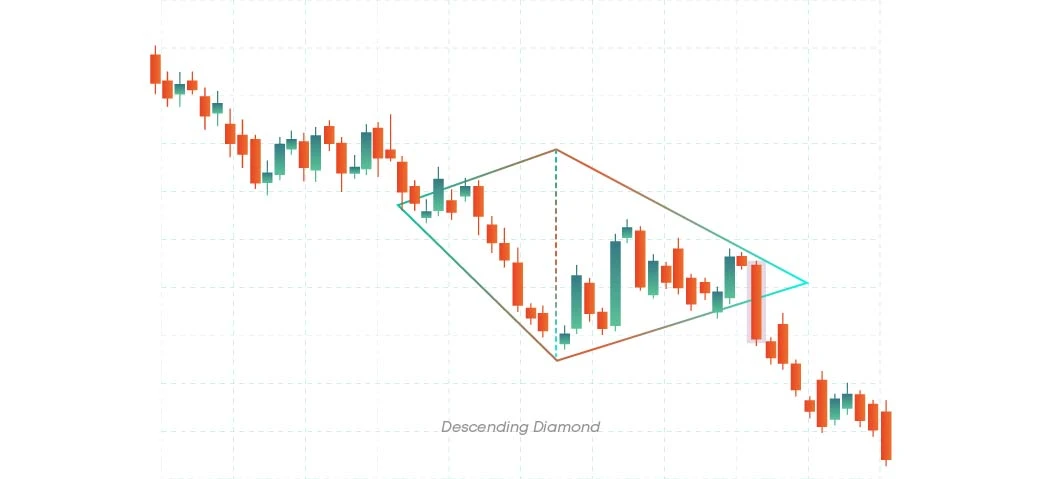
Descending diamond is more of a bearish continuation pattern. You can spot a descending diamond pattern when the lower trendline on the price chart slopes downward, and the price respectfully breaks out below the lower trendline, causing the increase of the trading volume.
Take a long entry once the price breaks out below the lower trendline and place stop loss above the upper trendline of the diamond pattern.
V-bottom
V-bottom is a strong bullish reversal pattern that has an aggressive buying nature and occurs when the market completely reverses its direction.
In this pattern, the V shape forms at a support level. The price falls and then there is a rapid price increase until the breakout occurs. The beginning and the ending of this pattern create a strong resistance level and for the stock to continue, the level must break.
V-bottom patterns are very safe to trade with, and it is preferable to start trading after the breakout occurs.
Island reversal
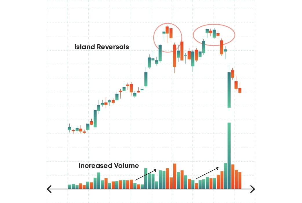
An island is a piece of price action that is completely broken off from the rest of the chart. It has a gap before it, known as exhaustion gap and the break after it is called breakaway gap. The two gaps must have an overlapping price range.
A bullish island reversal starts with a down gap in a bearish trend and is followed by a period of sideways trading. After that, the market gaps upwards to reverse the bearish trend.
The exhaustion gap represents a climatic move aligned with the existing bearish trend. However, instead of following through with the gaps’ momentum, the market slows down and consolidates, forming the island.
When a market makes a breakaway gap against the trend, it is a bullish reversal signal. The volume should decrease for the first gap and increase with the second one that is reversing the trend. It’s better to take a long entry before the price gaps away from the island. Place the stop loss below the breakaway gap and set the target equal to the height of the island from the top of the exhaustion gap and project it from the breakaway point.
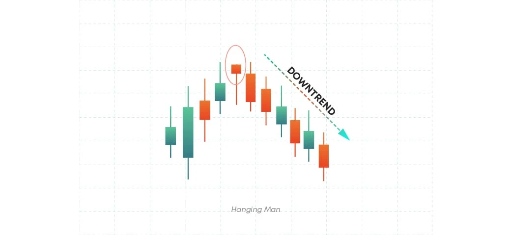
Hanging man
This is a single candlestick pattern which if formed at the end of an uptrend, indicates weakness in further price movement. It is a bearish reversal pattern which signals that the uptrend is going to end. The pattern has a small real body which means that the opening and closing prices are very near.
The real body can be either green or red, but this does not play a significant role. There is no upper shadow and the lower shadow is at least twice the length of the real body.
The long lower shadow of this pattern indicates that the sellers have entered the market and are trying to push the prices down. Traders can enter a short position at the opening price of the next bearish candlestick.
The stop loss can be placed above the high of the candlestick pattern. The reward can be set at least 1.5 times the minimum risk taken.
Shooting star
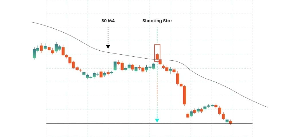
A shooting star is a bearish candlestick which has a long upper shadow, little or no lower shadow and a small real body. To be considered a shooting star chart pattern, a candlestick must appear during a price advance or an uptrend.
The long upper shadow represents that the buyers tried to push prices higher but there was a large selling pressure and bears regained control. The candle, formed after the shooting star, confirms its type.
The next candle must stay below the high of the shooting star and then proceed to close lower. It’s possible to take a short entry below the low of the shooting star and place the stop loss above the highs of the shooting star candle. The reward can be at least 1.5 times the risk.
Hammer
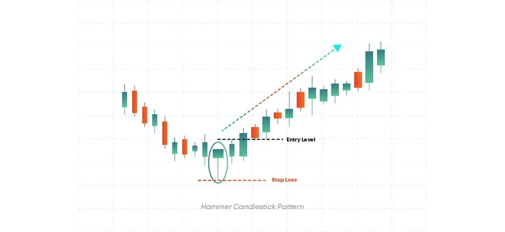
Hammer patterns usually happen after a price decline where the bears are dominant. It has a small real body and long lower shadow, which is almost twice the size of the real body, hence it appears as a hammer on the chart . The close price can be above or below the opening price which means the real body can be either green or red.
The hammer pattern near a demand zone shows the rejection of lower prices. The long shadow indicates the bullish dominance over bears which can signal a potential price reversal to the upside.
It’s better to take a long entry when the price breaks above the high of the hammer and place stop loss either below the hammer low or below the support level. The nearest resistance level can be set as the target price.
Doji
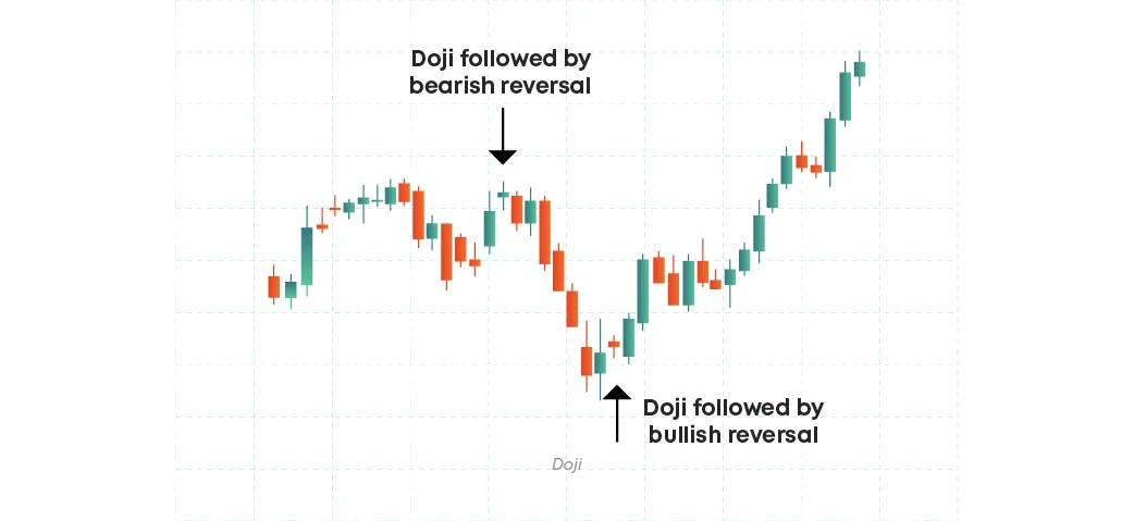
Doji candlestick signifies indecision with very close standing opening and closing prices. The price will fluctuate up and down, but at the end the price will return close to the opening price. A doji candlestick appears mostly with long shadows and very little or no real body.
Doji candlestick has 4 main types - the doji star, long legged doji (wish an upper and lower wick longer than the doji star), dragonfly doji (with very long upper and almost no lower tale, where the open and high prices are the same), and the gravestone doji (very long upper shadow with almost no lower tale).
Continuation patterns
Continuation patterns have a tendency to continue after the ending of a certain pattern. However, it’s important to note that not every continuation pattern results in a trend to continue.
Among the most common continuation patterns are triangles, rectangles, flags and pennants. Let’s have a closer look and analyse each pattern.
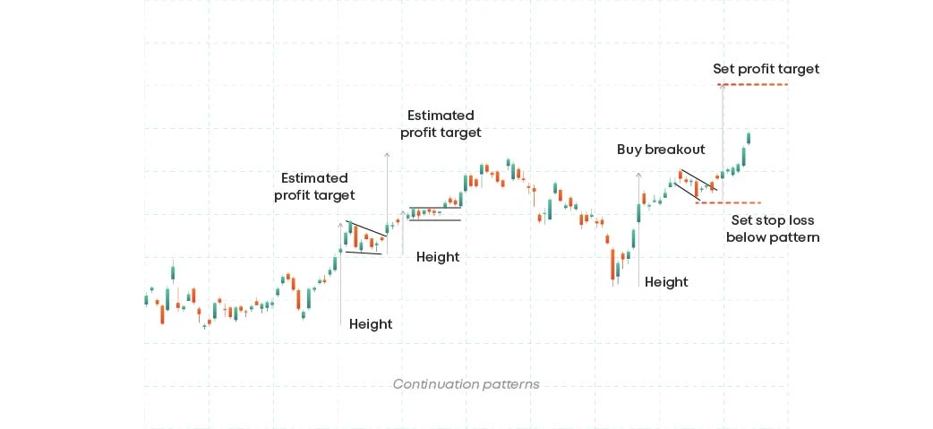
Triangles
When a price action in a stock becomes more compressed, that’s when we know we are dealing with a triangle pattern. This pattern can be ascending, descending and symmetrical.
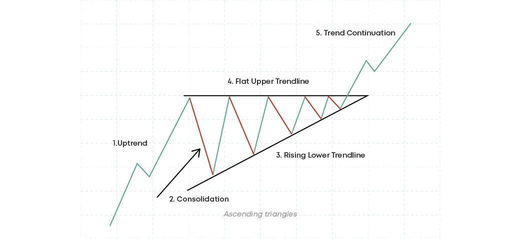
Ascending triangles
The ascending triangle, also known as the rising triangle pattern, consists of a flat resistance line that connects the highs of the pattern and has an ascending trendline that connects various higher lows, showing that the demand is rising and the buyers are slowly pushing the price up, strengthening the bullish bias.
The ascending trendline and the resistance line meet at a point called apex. The pattern is valid only if the price tests the resistance level at least twice and the support level at least three times.
If the market is in an uptrend before the ascending triangle pattern appears, this indicates a bullish continuation. And when the price breaks above the resistance, it indicates that the upside momentum will probably continue.
Enter a long position following a high volume breakout above the breakout candle or after a pullback to the resistance after breakout. The stop loss can be placed below the recent swing low.
To set the target, measure the distance from the lowest point of the ascending triangle to the flat resistance line and project it upward from the breakout point.
Descending triangles
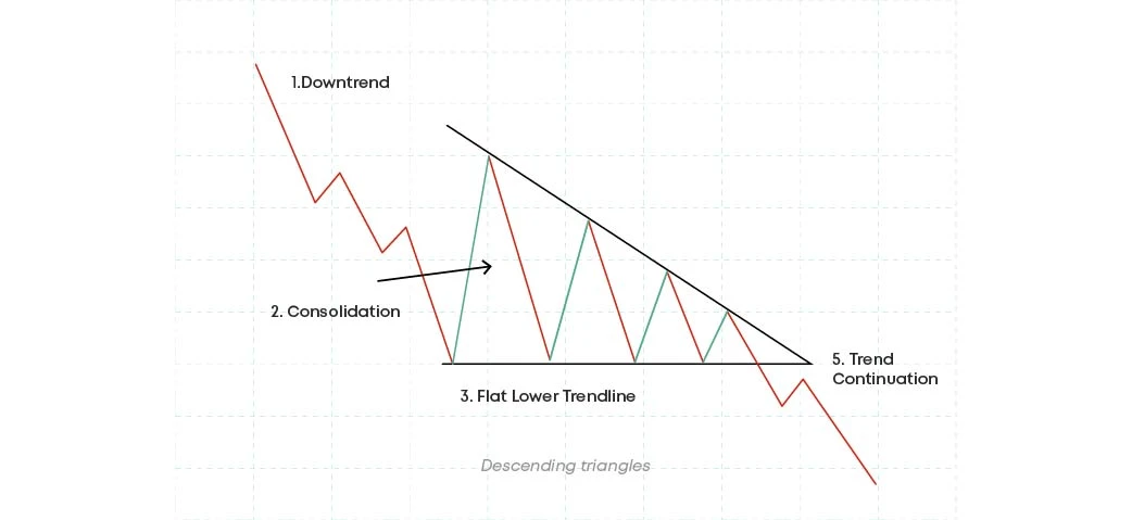
The descending or falling triangle continuation pattern consists of a flat support line that connects the lows of a pattern and has a descending trendline that connects various lower highs which shows that the demand is reducing and the sellers are slowly pulling the price down thereby strengthening a bearish bias.
The descending trend line and the support line meet at a point called apex. The pattern is valid only if the price tests the support level at least twice and the resistance level at least thrice.
If the market is in a downtrend when this pattern appears, it signals a bearish continuation. When the price breaks below the support, it indicates that the downside momentum will probably continue.
Enter a short position following a high volume breakdown below the breakdown candle or after a pullback to the support after breakdown.
The stop loss can be placed above the most recent swing high. To set the target, measure the distance from the highest point of the descending triangle to the flat support line and project it downwards from the breakout point.
Symmetrical triangles
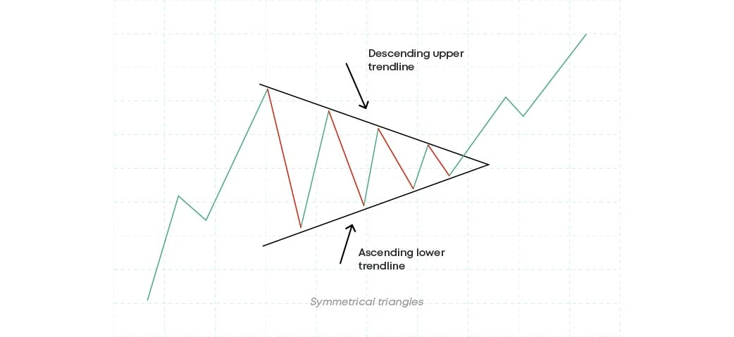
A symmetrical triangle pattern has symmetrical or equal sides that meet at the apex. This triangle has lower highs which are connected by a descending trendline resistance, which indicates weakening demand and has higher lows that are connected by an ascending trendline support which signals weakening of supply.
For the pattern to be valid it has to be made up of at least two lower highs and two higher lows. It looks like a funnel with a price squeezing from the left towards the right indicating a fall in the trading activity and a period of consolidation.
A breakout from the upper trendline shows the beginning of a new bullish trend. Real breakouts usually occur during high trading volumes and high volatility.
Take a long entry above the breakout candle high or after a pullback to the descending trendline. Place your stop loss below the ascending trendline support. To set the target, measure the distance from the highest point of the descending trend line to the lowest point of the ascending support line and project it upward from the breakout point.
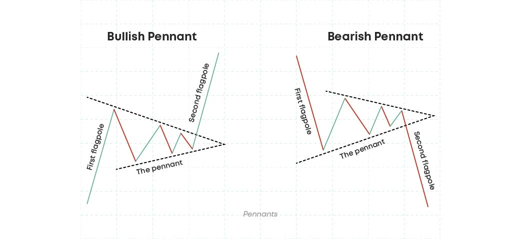
Pennants
Another type of crypto trading chart patterns are pennants. Pennants are much smaller forms of triangles, they can be bullish and bearish. Bullish pennant pattern resembles a bullish flag, which has a sharp uptrend pole followed by a brief consolidation and then uptrend. Bullish pennant gives a buy signal and has higher lows and lower highs.
Bearish pennants, unlike the bullish pennants, are like a pole but a sharp downward price movement and signal a price decrease.
Channel
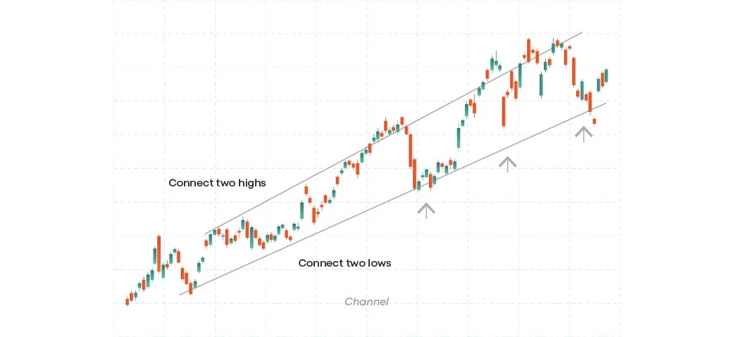
Channel patterns represent two trend lines. These trend lines act as boundaries to reach a larger market trend. For a channel pattern to be valid, each trend line has to have at least three touches. Channel patterns form during consolidation, they resemble a bull flag, with the difference that channels sometimes last up to several years.
Channels are considered neutral chart patterns and they can form at the top, bottom or even mid-point of moves.
Ascending channel
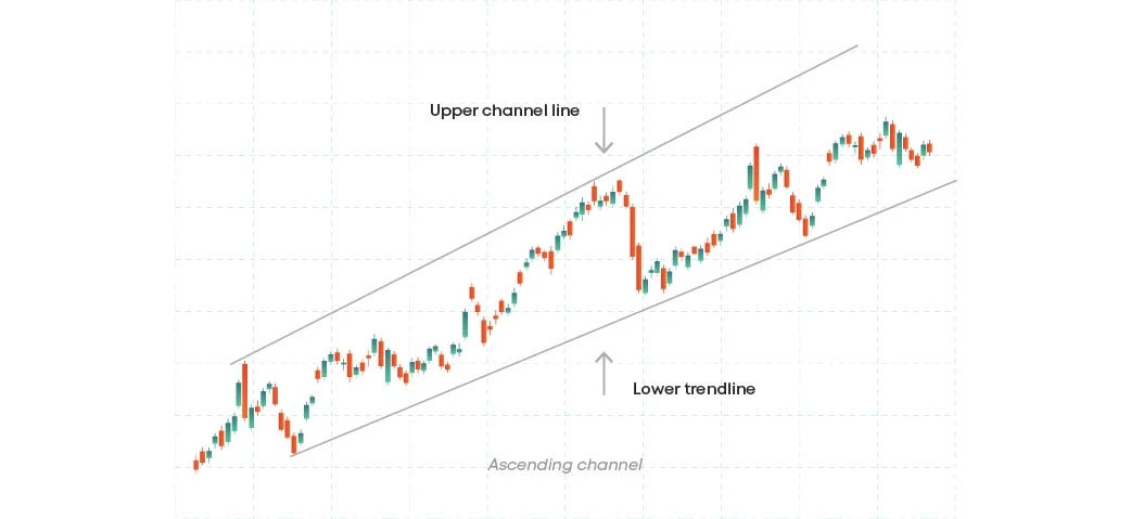
Ascending channels are bullish chart patterns with two trend lines drawn above and below a price. The trend lines support higher lows and connect higher highs with a diagonal resistance level.
A strong buy signal appears after a breakout occurs above the upper trendline and a breakdown below the trendline generates a sell signal. Ascending channels can signify the continuation of a trend or its reversal.
Descending channel
In the descending channel, the lower lows and the lower highs are connected, and it shows a downward trend with parallel lines. Selling bets can be set after the price reaches its resistance level, and the buying bets should be set after the price reaches the support trendline.
Parallel channel
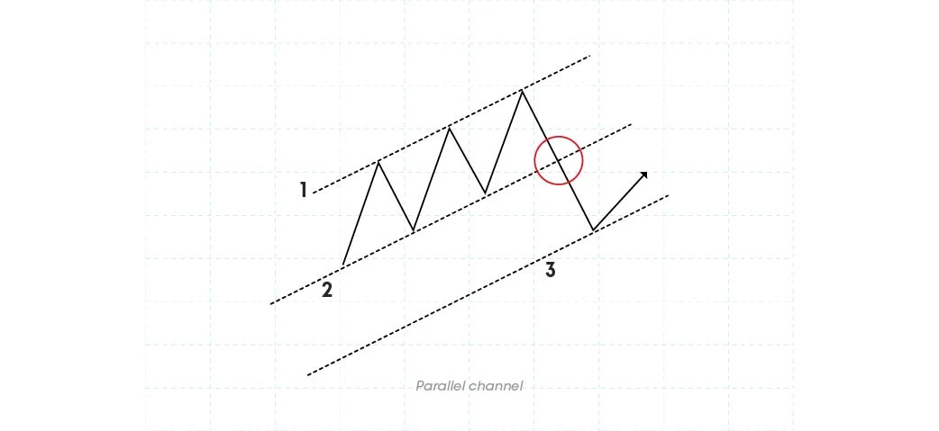
Click to change this paragraph text. This is not a Lorem Parallel channel chart patterns are among the most highly observable channel patterns, giving traders many opportunities in the market. The channel forms with 2 parallel trendlines.
The price breaks through the boundaries of the first trendline and navigates to find the next boundary, creating a parallel channel. This channel is easily formed, it is possible to measure the target and the stop loss point. text, but we still want to keep it long.
Cup and handle
As the name suggests, this pattern gives the impression of a cup with a handle, with multiple rounded lows giving it the teacup appearance with downward drift, the handle.
The cup forms after a bearish advance, followed by a period of consolidation, after which the bulls take over the bears gradually.
The volume should decrease towards the middle of the pattern and rise again towards the end of it.
The handle forms a trading range in the form of a pennant or a flag pattern on the right-hand side of the cup and is associated with low volumes.
The handle has to be smaller than the cup and not drop into the lower half of the cup, staying in the upper third. The handle is the last bearish push and when it fails, we expect the market to rise.
After the price breaks above the handle or above the resistance line, it’s recommended to take a long entry. Volume usually increases during a breakout so you may place stop loss below the handle of the pattern.
The target can be set equal to the height of the cup from the bottom to the top of the cup. The cups that have longer and more v-shaped bottoms, give a better, more precise signal.

Handle on the left
Cup and handle chart pattern, with a handle on the left, is a bullish continuation pattern where the handle appears on the left side of the so-called cup. With the price making a strong upward move, the left side of the cup is formed, then the price consolidates, creating the handle of the cup. After the price breaks out of the handle and moves upside, the upward trend continues.
Handle on the right
Handle on the right is the most common form of cup and handle chart pattern. It is very reliable and is mostly used by traders to identify possible buy opportunities in the market. The breakout occurs above the neckline of the cup and the handle extension to the right signifies that there is a consolidation period with lower trading volume.
Double cup and handle
The idea of double cup and handle pattern refers to double top and double bottom crypto trading patterns. These are “M” and “W” shaped patterns, where in the first case, bears have the upper hand, and in the second, the bulls.
As the bears sell, the prices will fall, and as the bulls buy, the prices will rise. The double top pattern hits the resistance level twice and fails to gain more buying opportunities, and the double bottom pattern hits the support level twice and fails to continue selling off.
Saucer
The saucer pattern mostly appears as a theme that reverses a downtrend into an uptrend. The market volume behaves similarly to the chart but reacts slightly ahead of the price due to the long-term nature of the technical structure.
The rounding bottoms of this crypto chart pattern signify a reversal in long-term price movements. The saucer pattern typically forms at the support trendline when there is a high volume selloff.
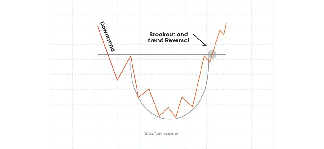
Shallow saucer
A shallow saucer pattern appears with a not very deep, rounded bottom with increasing trading volume. The breakout occurs above the neckline of the pattern which is the highest point of the rounded bottom. The price is likely to continue to move higher, once the price breaks above the neckline.
Deep saucer
Deep saucer chart pattern has a large, round bottom, deeper than the traditional saucer pattern. The trading volume increases, as the price approaches the neckline of the pattern. A confirmation signal of the prices moving upwards occurs when the price breaks out above the neckline.
Rounded tops and bottoms
Rounded tops and bottoms are among reversal chart patterns. On the price chart, they signal the reversal point that may occur after the end of a certain trend.
Rounded top
The rounded top is a “U”-shaped pattern. In certain analytical literature it is described as the inverted saucer. In case of a rounded top pattern, there is a signal of potential downtrend. This indicates that buyers become less interested in an asset. After the price breakout, it is possible to witness price moving lower.
Rounded bottom
In case of a rounded bottom pattern, the asset price forms a rounded bottom after a downtrend. It is characterised by increasing trading volume, round bottom and a breakdown above the pattern’s neckline.
You should enter the market once the price breaks above or below the neckline and place stop loss below the neckline of the pattern.
Use the distance from below the bottom of the rounded bottom to the neckline, to set the target.
Other technical analysis tools
Elliott waves
Elliott waves is among the most used financial analysis theories, developed and offered by Ralph Nelson Elliott back in the 1930s. With his theory, Elliott suggested that crowd psychology affects market movements.
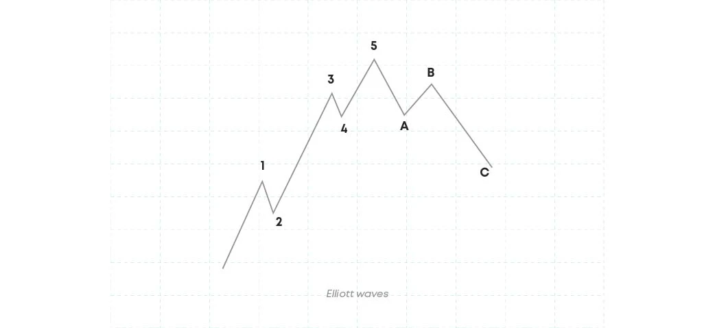
According to Elliott, the market moves in a series of five waves in the direction of the trend, and three more waves move against the trend. These five waves are known as motives, and the other three are called corrective waves.
Elliott theory makes it possible to predict trend reversals that help in setting targets.
The motive waves are labelled 1, 2, 3, 4 & 5, and the corrective waves are labelled as A, B, C.
Motive waves
As mentioned above, motive waves move to the direction of the trendline, and are labelled 1, 2, 3, 4, 5. Three of the waves are impulsive, and two of them are retrace waves.
1, 3, and 5 impulsive waves move the market in a particular direction, both upward and downward. Wave 2 comes after wave 1 and is a small downward movement. Wave 4 is still a small downward movement and follows Wave 3.
Corrective waves
Corrective waves take the stock price down. Waves A and C are made of five waves, while Wave B is made of three waves. In a bullish market, the corrective waves reverses the trend, while in the bearish market, the corrective waves result in the price to go up.
Fibonacci retracements
Fibonacci retracement levels are horizontal lines that help traders to predict the spots of support and resistance levels. To create a Fibonacci retracement, one needs to take two extreme points on a stock chart and divide their vertical distance on Fibonacci ratios.
The most common and widely used Fibonacci retracements are 0.382, 0.500 and 0.618. Each level is associated with a certain percentage. The percentages derive from the Fibonacci sequence and they indicate how much of a prior move the price has retraced. These percentages are 38.2%, 50% and 61.8%.
Harmonic patterns
The patterns that level up geometric price patterns with the help of Fibonacci retracements to define exact turning points in the stock, are called harmonic patterns. Relying on Fibonacci numbers, harmonic patterns can be used to create technical indicators.
Among the most famous harmonic patterns are Gartley, butterfly and crab patterns. The assortment is quite diversified, but these types are the most used ones.
Garley pattern
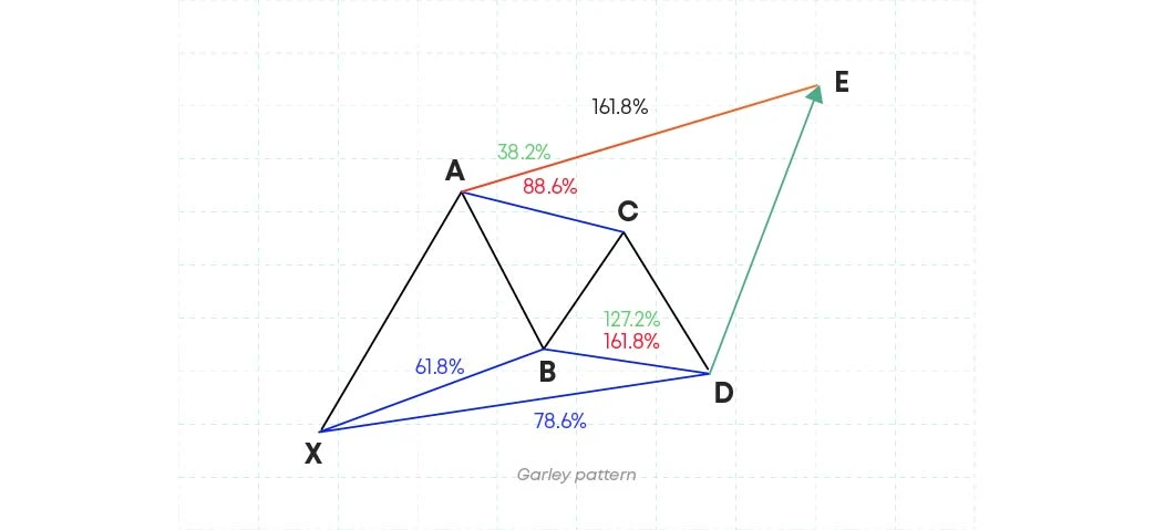
Gartley first spoke about this pattern in his “Profits in the Stock Market”, later adding Fibonacci numbers. Gartley pattern consists of four ABCD waves and can appear both in bullish and bearish markets.
The Gartley pattern usually signifies continuation of a certain trend. In a bullish Gartley pattern, the trend moves from X up to A, reverses at AB, resuming at BC and reversing again at CD. The bearish pattern is the exact opposite of the bearish pattern.
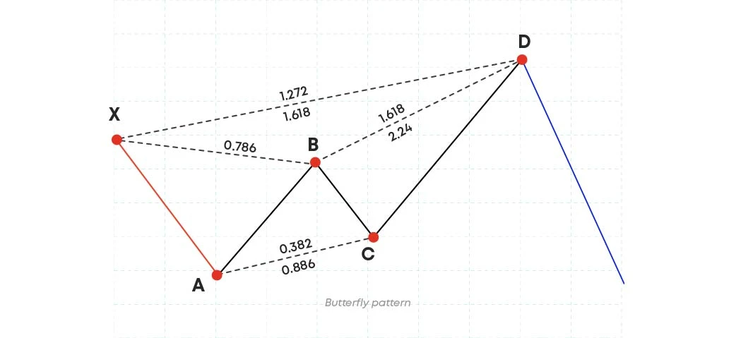
Butterfly pattern
Butterfly is a five-point reversal harmonic pattern that has specific shapes and distances between each leg of the pattern. The pattern is formed by four movements. Point X is the first leg and the starting point in the pattern and point A is the ending point, the highest or the lowest point of the pattern. Segments AB, BC and CD appear respectively in the wave.
Crab pattern
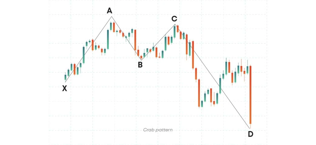
Like the butterfly pattern, the crab pattern is a reversal harmonic pattern, composed of four legs, labelled XA, AB, BC and CD.
Crab patterns indicate when a current price move is likely to end, and like many other patterns, it has bullish and bearish versions. The Crab’s ending point is a representation of the 161.8% Fibonacci extension of the XA leg.
The entry can be after the pattern reaches point D, and stop loss should be placed just below the point D.
Conclusion
There are plenty of chart patterns used in trading, some of them are more actively-used than others. In our article, we discussed the main types of crypto chart patterns, analysed how they work and what characteristics they have. Each pattern is unique and can offer diverse entry and exit points for profitable trading experiences. It is important to explore each formation and find the perfect fit for every trader.
Disclaimer: Includes third-party opinions. No financial advice.

